2025 ACM Awards
We’re beyond thrilled to celebrate our incredible MAX artist partners who’ve secured nominations for the 2025 Academy of Country Music Awards—our...
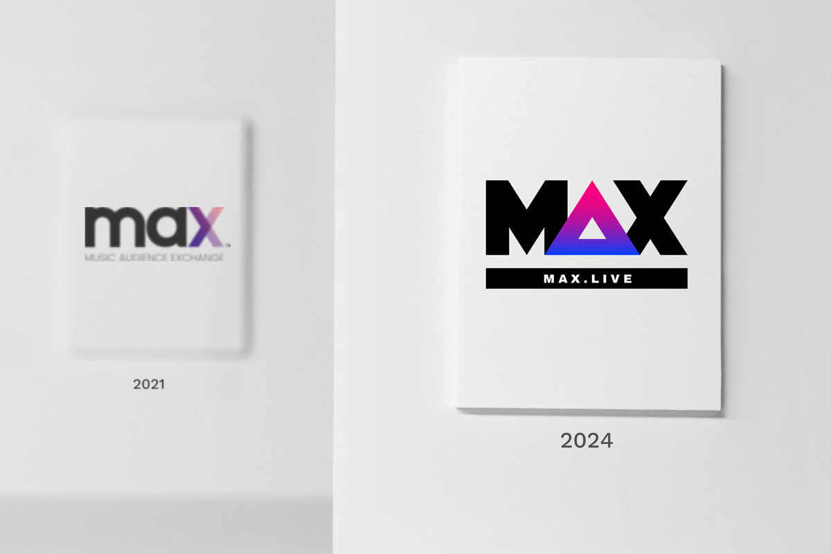
You might have noticed that we’ve given our branding a little update recently … a little glow-up, a little polish, a little yassification, even.
First of all, thank you for noticing–we’re always improving ourselves and wanted a look that matches our vibe–and we think we’ve totally nailed it. Bold. Confident. Creative.
(You totally got all of that looking at our new logo and colors, right? Exactly! We knew you’d get it.)
We are super excited about our new look–especially our new supporting identifier that reflects where our focus has always been: on the audience.
-1.png?width=214&height=728&name=Family%20Polaroid%20Photos%20Bookmark%20(2)-1.png) Honestly, we loved our old logo and branding. We put a lot of thought into all of it–from the little play button between the “a” and the “x” to the symbolic intersection of artists and brands in our big “X” supporting identifier.
Honestly, we loved our old logo and branding. We put a lot of thought into all of it–from the little play button between the “a” and the “x” to the symbolic intersection of artists and brands in our big “X” supporting identifier.
And, apparently, we weren’t the only ones who loved those details in our branding. 👀
A full two years after we launched our last brand refresh (almost to the day) another GIANT brand decided to drop the most recognizable part of their name and started going by just “max.” When they debuted a new logo with a similar font to ours that showcased the same little hidden play button, we were flattered but also worried that the similarities might start causing some confusion.
Then, one of the most well known brands in the world decided to abandon nearly two decades of brand equity (including an entire lexicon organically built around the brand). This particular rebrand included a new logo featuring an “X” that looked eerily similar to our supporting identifier and we started to feel a little . . . too flattered?
So, we decided that this was the time to reflect on who we are as a company and create new branding that truly represents who we are.
We already know that we have a huge footprint in the music/marketing/tech space. We need branding that reflects that.
Our new branding is big, bold, and a little loud (in the best possible way).
We take up space. We create. We innovate.
 We also know that we can say whatever we want about ourselves, but the true measure of who we are comes from the clients and artists we work with every day.
So we turned to our NPS surveys to see how our clients see us. We started by turning all of our client feedback into a word cloud–and we are beyond grateful for the glowing reviews we received from everyone. (for real, we got a little choked up over the nice things everyone had to say 🥹)
According to our clients, we are creative, reliable, clever, and fun.
We deliver on our promises, drive measurable results, and quickly adapt to changing circumstances.
Our new branding is solid and sturdy, from our new, heavier font to the triangle “A” in the center of our logo (ask us how deep down the math rabbit hole we went looking at the significance of triangles in creating stability … tangentially [haha, get it?], did you know that you can sign up to take calculus as an adult?? 📐).
About that triangle … we’ve put the spotlight in our supporting identifier back where it belongs: on the audience.
To be clear, we’ve always been focused on audiences—and now our branding truly reflects that. (also, it looks AMAZING on all of our new merch and if you ask us nicely, we’ll tell you how you can get your hands on our new swag)
In addition to our logo and supporting identifier, we’re using that triangle everywhere, including in our new iconography. Besides looking really, really, really cool, it also represents so many things—from amplification to funnels to brand love to spotlights.
 Oh, WE KNOW.
We are literally glowing and we cannot. 😍
Our updated color palette reflects the creativity, innovation, and fun that we put into every campaign. (also, see evidence proving how great it looks on our new merch)
Look, it happens to the best of us. We know exactly who we are and what we stand for, and yet, we find ourselves slipping into a voice that just sounds so much like … a … brand. *gasp*
We’ve done some soul searching (and a lot of listening to our clients, like we said before) and have found our voice—the one that reflects how we show up for our clients and each other.
We are authentic, open, direct, helpful, thoughtful, and (hopefully) clever.
We love having engaging conversations and want to find more ways to foster communication (so, you know, hit us up)!
So, anyway, thanks for letting us talk about ourselves for a hot minute—and we’d love to hear from YOU! Let us know how your brand shows up in the world and we’ll show you why our clients say we’re “creative, have lots of great ideas, and have a passion for what they do and the content they create.”
 We really are in love with our new merch and would love to get some in your hands! So, we’re putting together swag boxes and giving them away to everyone who schedules a brainstorm sesh with us until we run out.
Click the link below to sign up for a 30 minute swag discussion brainstorming session, tell us where you want your swag sent, and we’ll get you looking crispy in new tees, hats, and more!
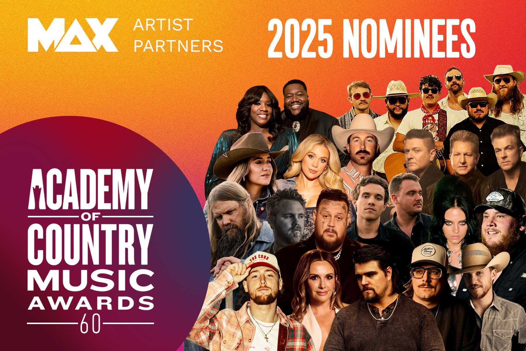
We’re beyond thrilled to celebrate our incredible MAX artist partners who’ve secured nominations for the 2025 Academy of Country Music Awards—our...
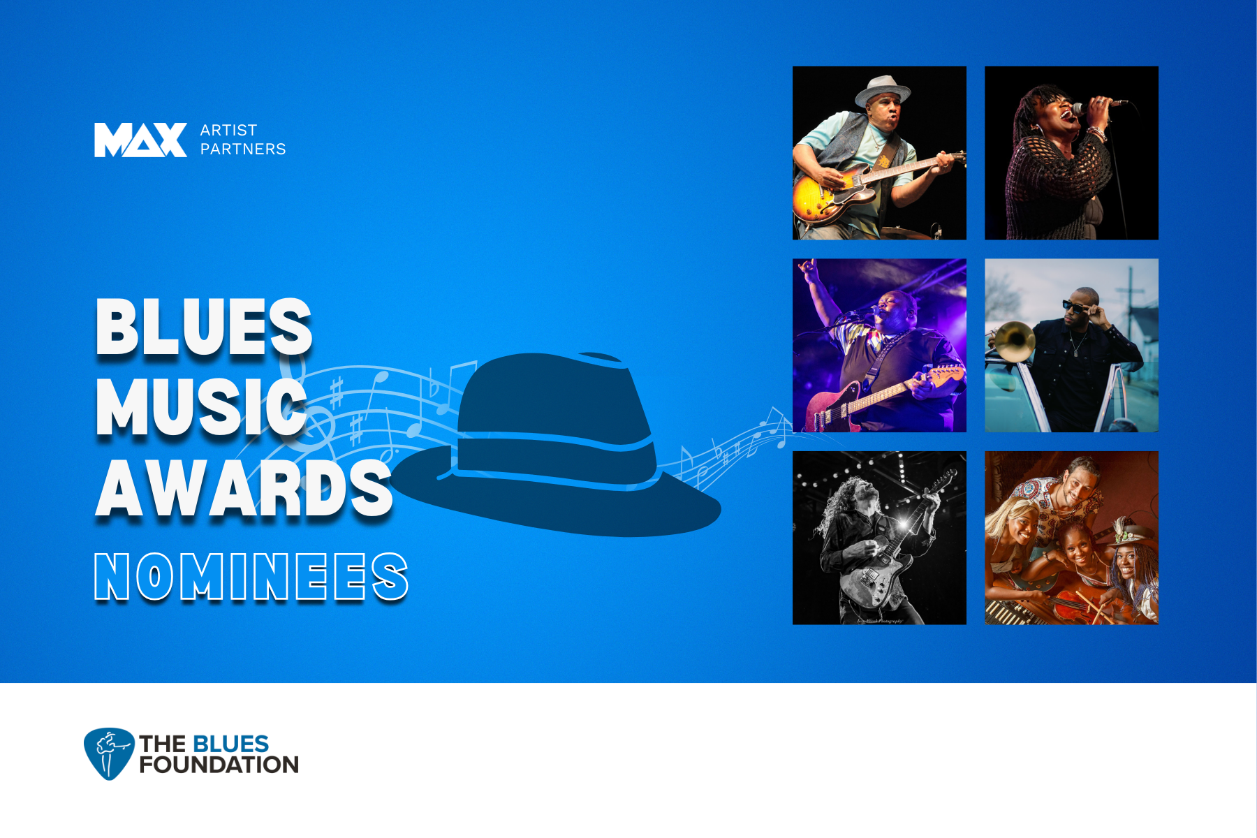
We’re fired up to celebrate our incredible artist partners who are nominated for the 2025 Blues Music Awards! 🎶🏆Blues music may be timeless, but...
It’s a common question: what drives the cost of an artist partnership up (or down)? I mean, an artist’s fee can range from four to seven figures…and...
Welcome to the very first episode of our MAXtape Live podcast!
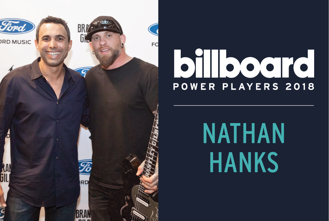
Pictured: Nathan Hanks (left), Brantley Gilbert (right) We're thrilled to announce that our CEO and Founder, Nathan Hanks was named as one of...
A lot happened in 2021. There were TikTok dance crazes, captivating album releases, bingeworthy TV shows, and so, so many Marvel movies (so. many.).
